Tutorial 6: How to use the visualization tools for interacting with the UMAP/t-SNE plots. An example using the Fly Cell Atlas
Of note
You can reproduce this tutorial entirely by cloning the public dataset ASAP53 (https://asap.epfl.ch/projects/ASAP53) which is the Malpighian tubule dataset from the Fly Cell Atlas.
In this tutorial we will show you how to visualize Fly Cell Atlas (FCA) datasets, and how to navigate across all the different steps.
Of course, ASAP is very modular, so don't hesitate to try out other methods, that we would not have described in this tutorial.
Moreover, here we show traditional pipeline steps, but you can also run the steps in a different order, or even skip some steps if you don't think they are needed.
Step 1: Select a dataset from the Fly Cell Atlas
There are two ways to select a dataset from the Fly Cell Atlas:
From the main FCA website
at https://flycellatlas.org/, in the "Tissues" or "Data" section. Here you have a list of all datasets available in ASAP, and a direct link that opens the project in ASAP.
From the ASAP website
In the top bar of ASAP, you can click on "Data > Fly Cell Atlas" to see a list of all available datasets, and some additional info (nb cells, nb genes, etc.)
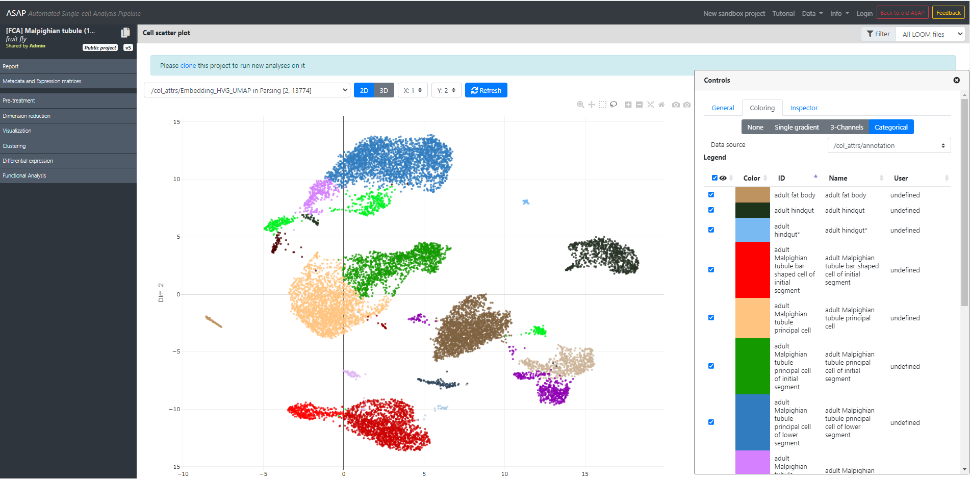
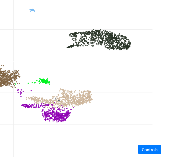
In our case, you can select Malpighian tubule (stringent), which will open the project in ASAP, and directly jump to the "Visualization" step where we plot the UMAP, colored by cell-type annotation. You should see this page:
Of note
UMAP/t-SNE/Clustering were made using the VSN pipelne described in the Fly Cell Atlas paper. The visualization should perfectly match what you see in the paper, or what you see in SCope's web portal.
Step 2: Visualization and interaction with the dataset
From this view, you can hover your mouse on the cells, and you will see more informations (cell name, if activated in the "General" tab), cluster or cell type (depending on the current coloring), etc.
Let's look at the top-left options:
Here you can see multiple options controlling the plot you see:
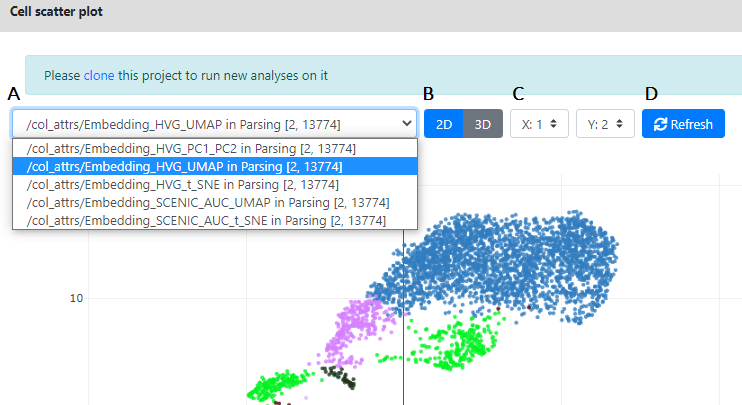
- A. Here is the list of visualization/dimension reductions available to plot in 2D/3D. In the Fly Cell Atlas datasets you will always see 5 of them.
- HVG_PC1_PC2: These are the two first components of the PCA, ran on the normalized/covariate-removed matrix, restricted to its 2000 top Highly Variable Genes (HVG)
- HVG_UMAP: These are the two first components of the UMAP, ran on this PCA
- HVG_T_SNE: These are the two first components of the t-SNE, ran on this PCA
- SCENIC_AUC_UMAP: These are the two first components of the UMAP ran on the AUC of the Scenic pipeline
- SCENIC_AUC_UMAP: These are the two first components of the t-SNE ran on the AUC of the Scenic pipeline
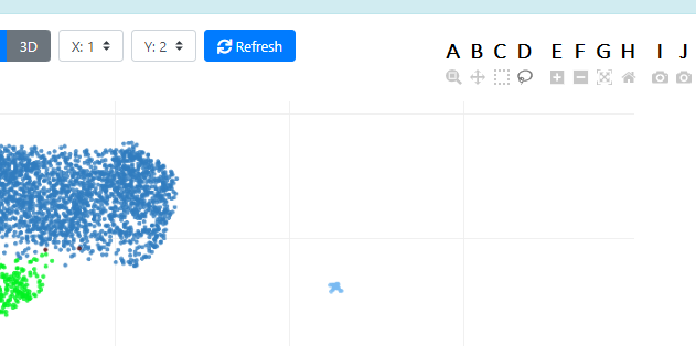
- B. Here you can change the view from 2D to 3D, in case more than 2 dimensions are computed. In this example, the imported data from the FCA only have 2 dimensions available per dataset. So we cannot plot 3D representation of the data. But if we run our own UMAP/t-SNE on the data, we will be able to plot it in 3D.
- C This controls what is plotted in xyz coordinates. By default dimension 1 is on x and dimension 2 is on y, but you can change this.
- D This [Refresh] button force the refreshing of the plot. It could be useful in case the visualization is frozen, or if you want to resize the plot
Of note
In general, we focus on the t-SNE or the UMAP ran on the PCA, so the other visualization are less important
For more information on the generation of these dimension reductions, please check the VSN pipelne described in the Fly Cell Atlas paper.
Let's look at the plot icons:
These are the standard icons from plotly, maybe you saw them before. Here is what they do:
- A This is the Zoom tool, you can select a portion of your plot and zoom in (mouse wheel is deactivated, and will not work for Zooming). Double-click on the plot to get back to the default zoom.
- B This is the Pan tool, you can move the data around (by translation). Double-click on the plot to get back to the default view.
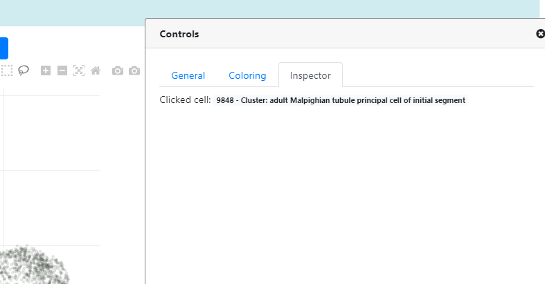
- C / D These are the Box and Lasso selection tools, you can select cells using these tools directly on the plot. You can deactivate the selection by double clicking on the plot. Once cells are selected, your selection will appear in the "Inspector" tab on the right "Controls" panel.
- E / F These are other Zooming tools. Contrary to the magnifier tool (A), you cannot control the region you zoom in/out.
- G / H These tools have similar effects than the double click. They reset the view to default.
- I / J These tools are for saving the plot in PNG or SVG (vectorial), respectively.
Now, let's look at the Controls panel
If the "Controls" panel is not currently visible/open, you should see a "Controls" button on the bottom right:
Once clicked, the Controls panel opens, and you can see three main tabs (A, B and C):
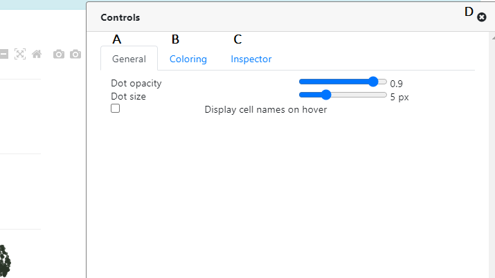
- A This is the General tab, controlling the points/cells options. Here you can control the point opacity / size, and you can activate the "cell name" which will appear once you hover your mouse on a particular cell.
- B This is the Coloring tab, it controls the coloring of the plot. We will explain this tab in more details in the next section.
- C This is the Inspector tab which controls the selections. We explained this tab in the last section, once you use one of the "Selection" tool.
- D This arrow allows to close the "Controls" panel, switching back to a full screen of the plot.
Of note
In general, the "Controls" tab is closed by default. Here it's opened on the Coloring > Categorical > Annotation because this is the default view/coloring that we set for any Fly Cell Atlas dataset.
Now, let's look at the Coloring tab in the Controls panel
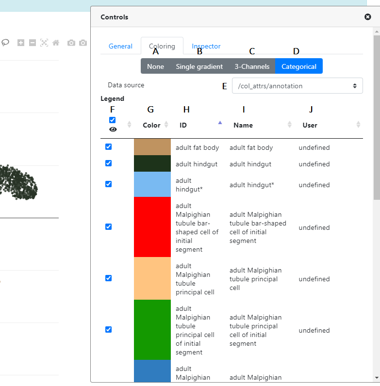
First, you can see that there are 4 options to color your plot.
- A This will remove all coloring of the points (all points become blue)
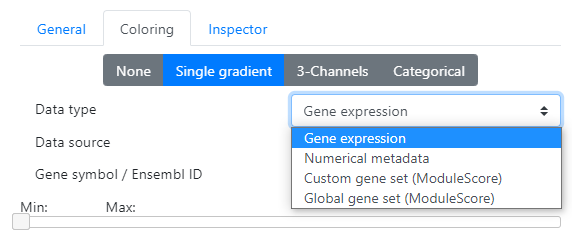
- B This is where you can color your points according to continuous features. Please note that depending on the nature of the metadata, you should select the "Continuous" or "Discrete" tab, accordingly.
-
In the B "Continuous" tab, you have the possibility to color according to different data types:
- Gene expression You can color the cells according to certain gene expression. Just enter the name of the gene (symbol or Ensembl ID) in the corresponding text box (there is an autocomplete feature to help you)
- B This is where you can color your points according to continuous features. Please note that depending on the nature of the metadata, you should select the "Continuous" or "Discrete" tab, accordingly.
- C This is the Inspector tab which controls the selections. We explained this tab in the last section, once you use one of the "Selection" tool.
- D This arrow allows to close the "Controls" panel, switching back to a full screen of the plot.
Of note
For coloring, it's very important to differentiate continuous vs discrete coloring. If the metadata you want to use for coloring is continuous (gene expression, continuous metadata / scoring), then you should go to the "Continuous" or "3-Channels" tab, if it's discrete (categories, clustering, ...), please go to the "Discrete" tab.
Of note
Visualization options explained in Step 2 of this tutorial are common to all projects on ASAP, and are thus not specific to the Fly Cell Atlas projects.