Tutorial 2 : Full pipeline on a project imported from the Human Cell Atlas
Of note
You can reproduce this tutorial entirely by cloning the public dataset ASAP2 (https://asap.epfl.ch/projects/ASAP2). You can even delete the "Cell Filtering" step just after cloning, so all steps will be emptied (since all further files are computed from this step), and you will start with a fresh project.
In this tutorial we will show you how to create a full single-cell analysis pipeline in ASAP.
Of course, ASAP is very modular, so don't hesitate to try out other methods, that we would not have described in this tutorial.
Moreover, here we show traditional pipeline steps, but you can also run the steps in a different order, or even skip some steps if you don't think they are needed.
Create Project
Once you registered, or after creating a sandbox project, you should see this page:
Here you can choose to upload your own dataset or fetch a dataset from the HCA. If you do, you will end up with the following screen.
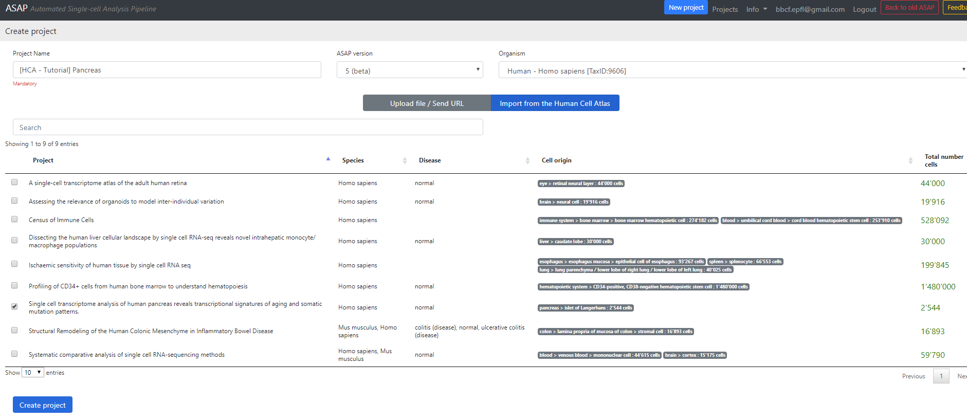
Here you can select a project to download from the Human Cell Atlas server (here I selected the Pancreatic data).
Then you can change the project Name, and the organism of interest (here Homo Sapiens). The database currently hosts ~500 species downloaded from Ensembl (see versions for more information).
Finally, you can select the version of ASAP that you want to run the project on. By default the last stable version is selected, here I chose the beta version (v5).
Then press the "Create Project" button.
Step 1: Parsing
ASAP server is now contacting the HCA website to download the dataset. From this stage, you should be able to see the project in the home page of ASAP, in the "My projects" section.
Once the parsing step is finished, the main page of the project should look like that:
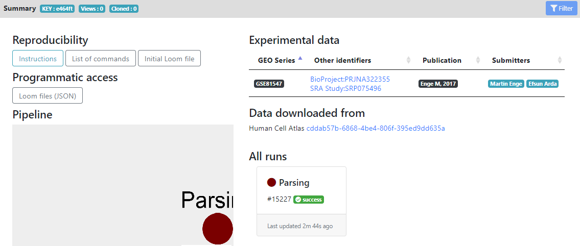
Here you see in the left panel the list of steps/tools that can be run on the dataset. "Report" and "Metadata" sections are showing informations about the loom files and metadata generated, while the other sections are the modular pipeline that you can run.
In the main panel, you have the "Reproducibility" section, that contains the initial .loom file after parsing and list of commands for reproducing the pipeline locally.
The "Programmatic access" section allows other portals/tools to know the .loom files that are generated, for future exchange of data.
The "Pipeline" section currently contains only the "Parsing" step that was ran, but will be populated by all the analysis that you will perform, as you advance in your pipeline. It shows a tree of the pipeline that you ran (using Cytoscape).
On the right, you have external links that are populated automatically for HCA projects. In the "Experimental data" section you see the GEO/Array Express accession numbers of the raw data, and the publications that are linked to these datasets. They are generated automatically for HCA project, but if you create a project from your own files, you can later add accession numbers and publication informations from the "Settings" wheel icon next to the project name.
Finally, in the "All runs" section, you see all the tools that were ran during this project, and their status (success, failed or running). Here we did not run anything yet, so only the Parsing step is shown as succeeded.
Then you can click on the "Parsing" step to see the results of the parsing.
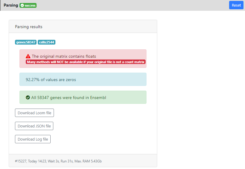
In this page you can see a panel "Parsing results" showing the results of the parsing step. In particular you can see that the dataset contains 58347 genes and 2544 cells. 92.27% of the values were equal to zero. And all the genes were correctly mapped to the version of Ensembl that is installed on ASAP v5 (since I used v5 when I created the project). This means that some stats will be computed like "ratio of mitochondrial genes" or "ratio of protein coding genes", and that you will be able to perform the last step of the pipeline: "Functional Enrichment" into GO/KEGG and other gene sets/pathways without issue.
Here you also see a warning message in red: "the data contains float". It means that some tools will not be available for this project (such as DESeq2 that uses raw counts modeling). Here it is just because this dataset contains estimated counts, so this is not a big issue, but as far as possible, it is always better to work with raw count data.
Finally, in the bottom of the result tab, you can see the date when the job was run, how much time it took, and how much RAM it consumed. This can be useful for benchmarking certain methods. In developement, we are preparing an estimation of these value, prior to the run. So you can know if the method is scalable/applicable to your dataset.
Also you can download from the results section the .loom file that was generated after parsing, in case you want to load it locally on your computer (using loomR in R or loompy in Python).
Then, from the left panel, we can click on the next step of the pipeline, the "Cell Filtering"
Step 2: Cell filtering
In this step, we remove cells that are not passing standards QCs, such as number of UMIs, detected genes or too many mitochondrial reads.
You can click on "New cell filtering" to generate a novel cell filtering job. It will open the following page:

Here you can see some stats on your dataset. There are five panels, each showing a different statistics, where you can set specific thresholding for filtering out cells that would not pass the QC.
In all panels, a point is a cell.
Of note
When a threshold is selected in one of the 5 panels, all other panels are automatically refreshed so the user can see the kept cells (green) and the ones filtered out (grey). A recap of the final number of selected vs. filtered out genes is available in the top bar.
- Panel A. Number of UMI/read counts per cell (sorted in descending order). This plot is similar to the plot generated by CellRanger in the 10x pipeline. You can select a minimum number of UMI/reads per cell.
- Panel B. Number of UMIS/Read counts vs number of detected genes.
- Panel C. Ratio of reads that maps to mitochondrial genes (vs all mapped reads). This uses the Ensembl database to know on which chromosome the genes are mapping, so only genes that are mapped to our Ensembl database are taken into account.
- Panels D. & E. Similar than C. but using the biotype of the genes from Ensembl for knowing if the reads map to a protein-coding gene (D), or to a ribosomal gene (E).
You can whether click on the plot to change the threshold, or change directly the value in the text box below the plot of interest. When you press "Enter" it validates the threshold and refresh all plots. On the top panel, you can also see how many cells are left after applying this threshold.
Of note
You can also select a metadata from your .loom file for filtering cells. For example, if the HCA data you downloaded has two organ parts, you can filter one completely to study only the other.
When you press "Save" then a novel .loom file is generated containing only the cells after filtering (here 2379 left)
Once again, when the .loom is created, the step will pass to the "success" state, and you will be able to move on to the next step.
Now you can click on the "Gene filtering" step
Step 3: Gene filtering
In this step, we remove genes that are too lowly expressed, or we focus on the most highly variable genes (HVG).
You can press the "New gene filtering" button to create a novel gene filtering
Info: We are currently considering separating the HVG step from the actual gene filtering step. This should be done in a future version of ASAP.
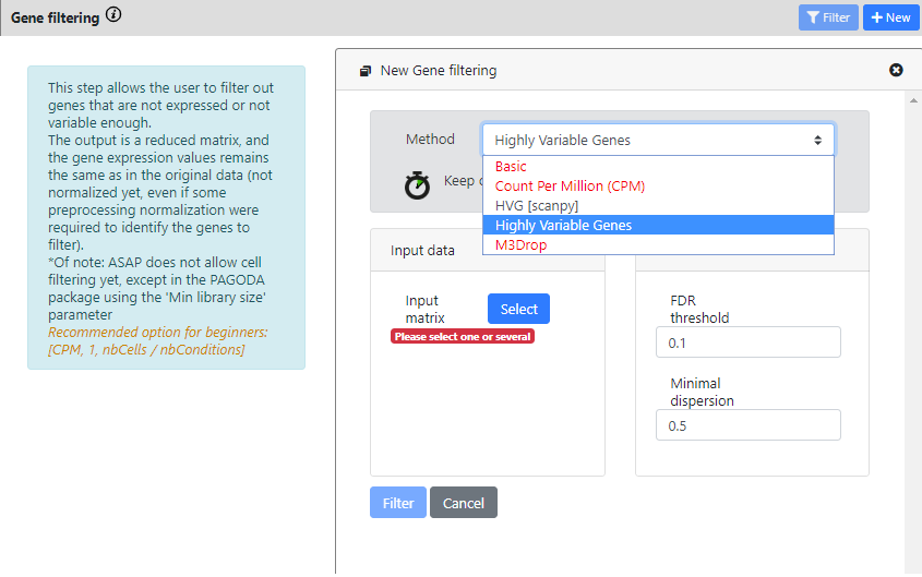
Contrary to the previous steps, here you see that there is more than one method available for Gene Filtering. The most common methods for single-cell RNA-seq are the 3 last ones.
- HVG [scanpy] is a scalable method from the scanpy package, to compute highly variable genes.
- Highly variable genes method comes from Seurat v2 package and is using Brennecke et al method.
- M3Drop method, more specifically the Depth-Adjusted Negative Binomial (DANB) model, which is tailored for datasets quantified using unique molecular identifiers (UMIs).
Of note
We are currently implementing the last Seurat v3 "vst" method for computing HVG
With this dataset, you can see that some methods are in red. They cannot be ran, because the data was identified as "non raw counts", so you can only run the two HVG methods.
I will actually run both, to see the difference of output.
For the scanpy method, you need to uncheck the "data is log" button if the data is not logged
For each method you need to select the dataset you want to run the tool on. Here we can choose only "Parsing" or "Cell Filtering" because we did not run other steps yet.
I will choose "Cell Filtering" for both, because I don't want to run HVG on cells that are of low quality
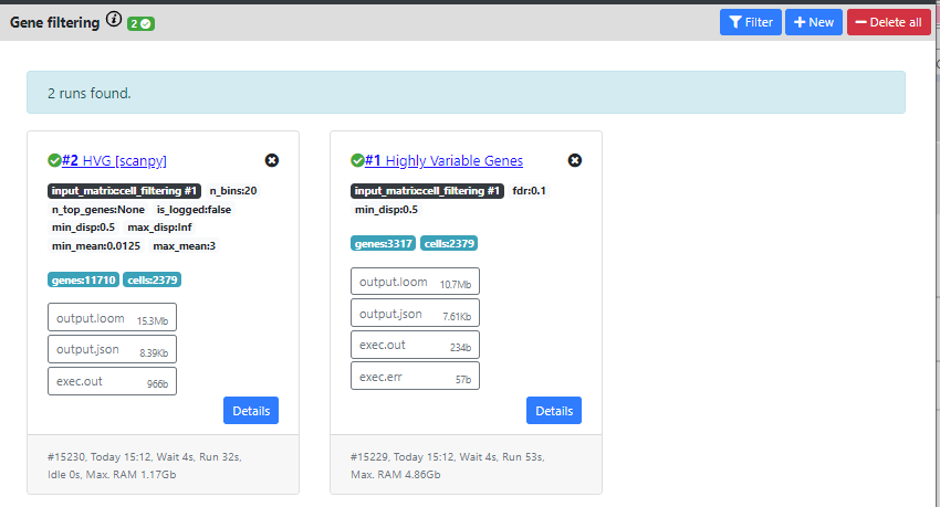
Now, you can see that both methods were computed and produced different outputs.
The HVG method from Seurat found 3317 genes that are highly variables, while the method from scanpy found 11710.
Typically, one would expect between 1000 to 3000 genes as highly variable, so 11k seems too high. We will thus continue the pipeline with the results from Seurat.
You can also delete one results by clicking on the "X" on top of the card containing the results.
Once again, you can download the .loom files generated by this step by clicking the "output.loom" button. In case you want to continue the pipeline outside of ASAP.
If you click on "Details" you can see some extra information about the run.
In the case of Gene filtering, and especially in the HVG calculation, this can be interesting, so I will click on the "Highly Variable Gene" card to see these details.
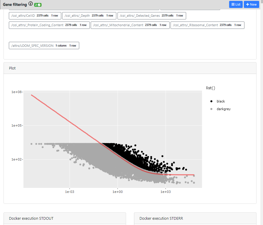
Here you can see the different outputs of the run: 1) metadata that were generated/added to the loom files, 2) interactive plots if they exists for this method, and 3) Docker execution standard output / error
The plot is completely interactive, so you can hover on the points (every point is a gene) and see to which gene it corresponds, its name and values.
Now we will go to the next step: "Normalization".
Step 4: Normalization
In this step, we normalize the cells/samples to remove effect of depth and other library biases.
You can press the "New Normalization" button to create a novel gene filtering
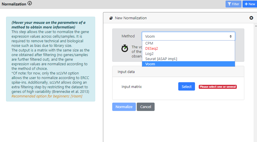
Again, you see that this step has multiple methods to run your dataset on.
DEseq2 is red because the dataset is not identified as a raw count matrix, so it cannot be used
CPM, DESeq2, Log2 and Voom are standard bulk RNA-seq method. So if your dataset is a bulk RNA-seq dataset, you can use these methods (yes, ASAP also works for bulk RNA-seq datasets). If you have single-cell data, then probably you want to use a normalization that is more typical in scRNA-seq analysis.
Here I will use the Normalization from Seurat, and I will run it on the "Highly Variable Genes" results, since I found it was the best one from the last step.
I keep the default scaling factor, but of course you can change this value if you think it would be useful for your dataset.
Of note
The normalization of Seurat was not scalable in our tests, and we could not run it effectively on datasets with millions of cells. So we rewrote it in Java for faster computation and for maximum scalability. That's why it is written "[ASAP impl.]"
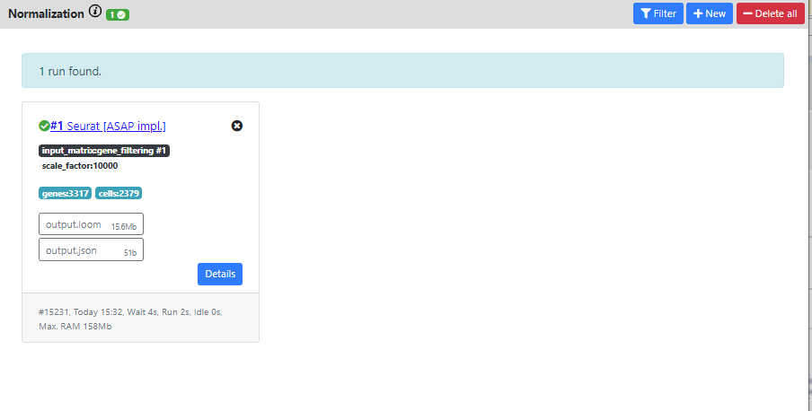
Again you can see the output of the pipeline.
The resulting dataset is 3317 genes vs. 2379 cells which corresponds to the filterings I used in the previous steps.
Now I'll move to the next step: "Scaling"
Step 5: Scaling
In this step, we scale dataset, which is a good practice before running a PCA or a clustering.
So the goal will be to use the scaled dataset for these 2 steps, and use the normalized dataset for the differential expression step.
You can press the "New Scaling" button to create a novel scaling
Of note
For the moment, only one method is implemented (the basic scaling from Seurat). In the near future, we plan to add the possibility to regress out covariates (metadata) and to integrate several dataset (batch effect correction). It is not yet possible to do that.
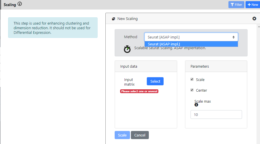
This step only takes the normalization output as input. And I keep the default parameters for running it.
Then once again, you see the results of the run in a "Success" card.
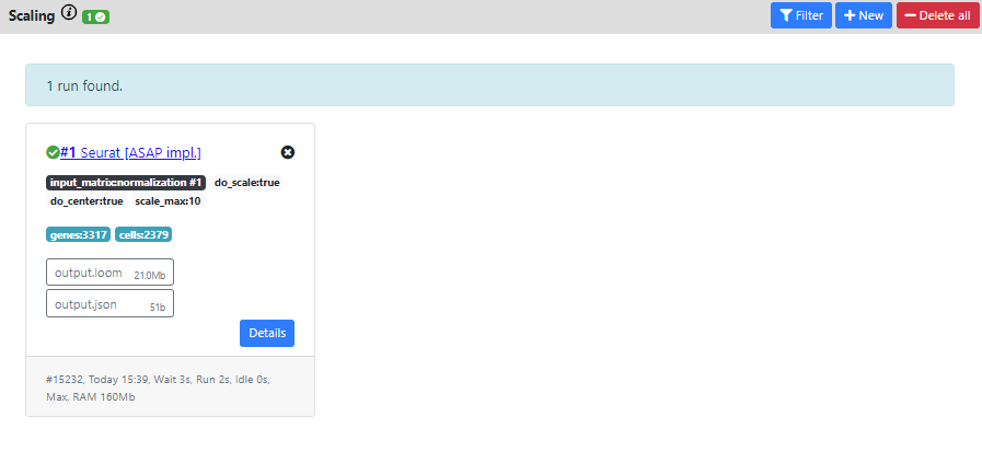
The resulting dataset is still 3317 genes vs. 2379 cells which corresponds the same filtering than the normalization you used as input (normal, since scaling does not perform extra filtering).
Now I'll move to the next step: "Dimension Reduction"
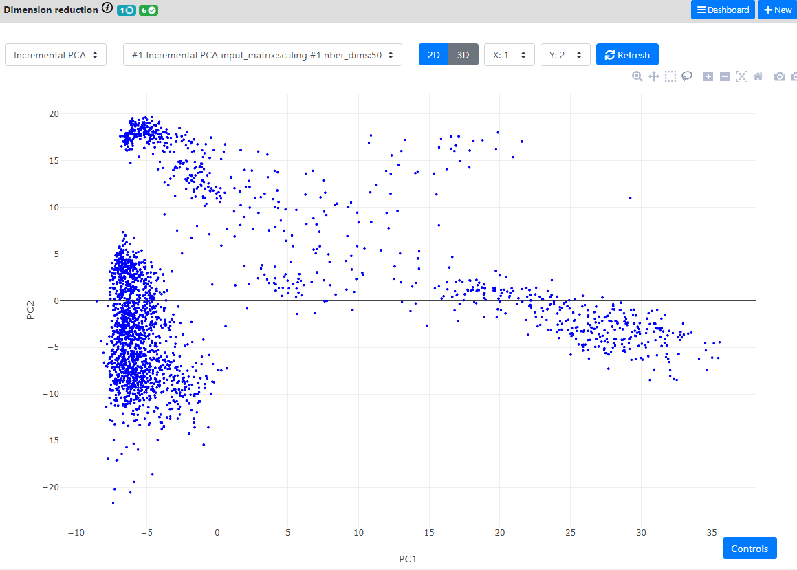
Step 6: Dimension Reduction
This is probably the step in which you will spend the more time.
In this step, we aim at visualizing the multi-dimensional dataset into 2 or 3 dimensions.
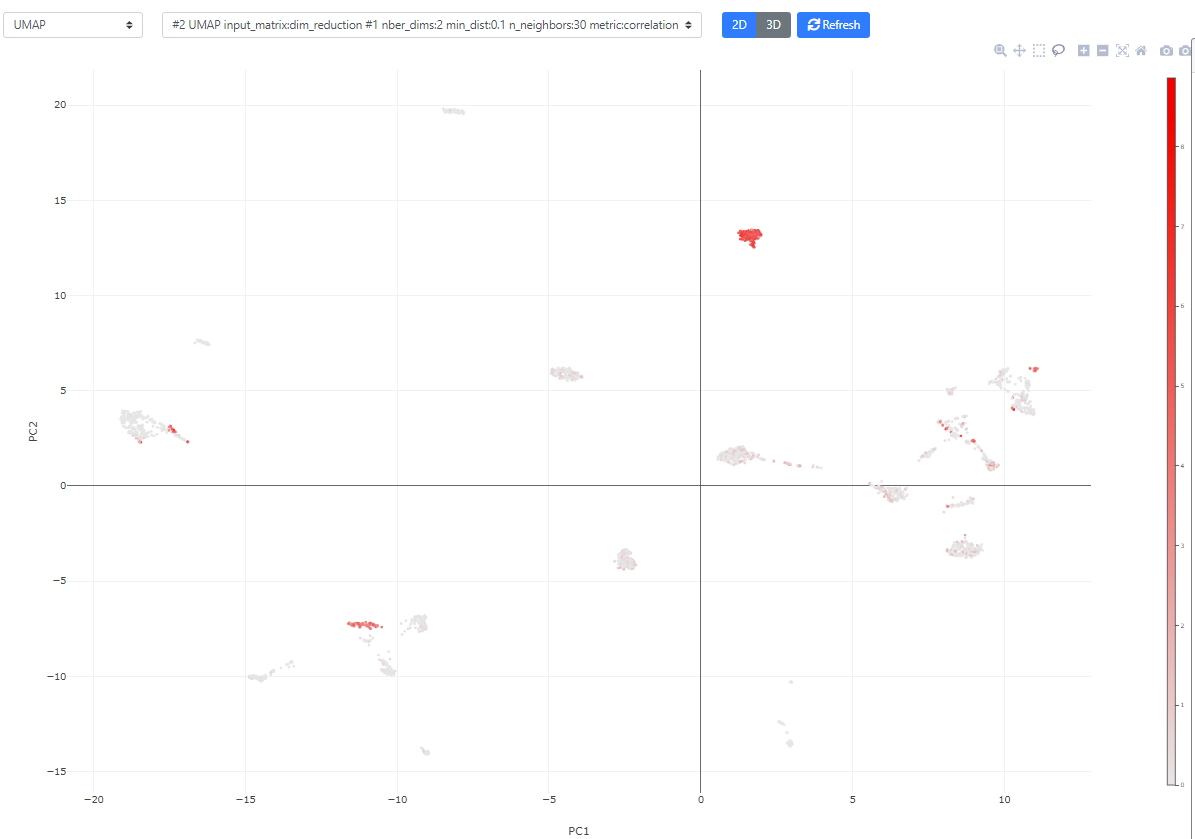
Then, you can color the cells according to external metadata (such as sex, library type, depth, batch, etc.), clustering results, or gene expression.
The plot is also dynamic, so you can select cells of interest to create new metadata, for example for performing a novel differential expression calculation.
Finally, you can also annotate the clusters according to the annotation of its marker genes (with a cell type for example), whether from this view, or directly from the "Marker Gene" view in the differential expression step.
The main methods for doing this are called "dimension reduction" techniques. In single-cell RNA-seq pipelines, this always starts by performing a PCA and keeping the 50-100 first components (it could be more or less, depending on the size of the complexity of the dataset). Then, once the PCA is computed, we use it instead of the main dataset for computing the other dimension reduction techniques or the clustering (which also speeds up the process).
Of note
In the Seurat pipeline, they suggest to use Jackstraw plots to find the optimal number of components to keep. This is not yet implemented in ASAP. For now we simply keep the 50 first components.
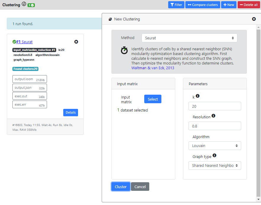
You can press the "New Dimension Reduction" button to create a novel PCA
Here, the good practice asks us to first generate a PCA. We will use an iterative PCA which are much faster to compute, and here is also using the chunking system of the .loom file to perform out-of-RAM computations.
By default 50 Principle Components are computed.
Then, when the PCA is finished, we will run both t-SNE and UMAP on the resulting PCA.
t-SNE is a very popular tool for visualizing single-cell RNA-seq data, but suffers many inconvenients:
- The main issue is the representation of the clusters. Whereas the local distance (intracluster) is meaningful, the intercluster distances are meaningless. Thus two very distant clusters can actually be very close in similarity, and reversely.
- It is stochastic, therefore 2 runs may generate different outputs. There is an exact version which is not stochastic, but requires more much time/RAM to run. If your dataset is not too big, we still recommend to use the exact version (beta = 0).
- It is slow as compared to UMAP (even though for small datasets, the difference is acceptable)
Now, let's look a bit more into the available plotting/visualization options.
You can switch between the "Dashboard" and "Plot" view by clicking the blue button on the top bar.
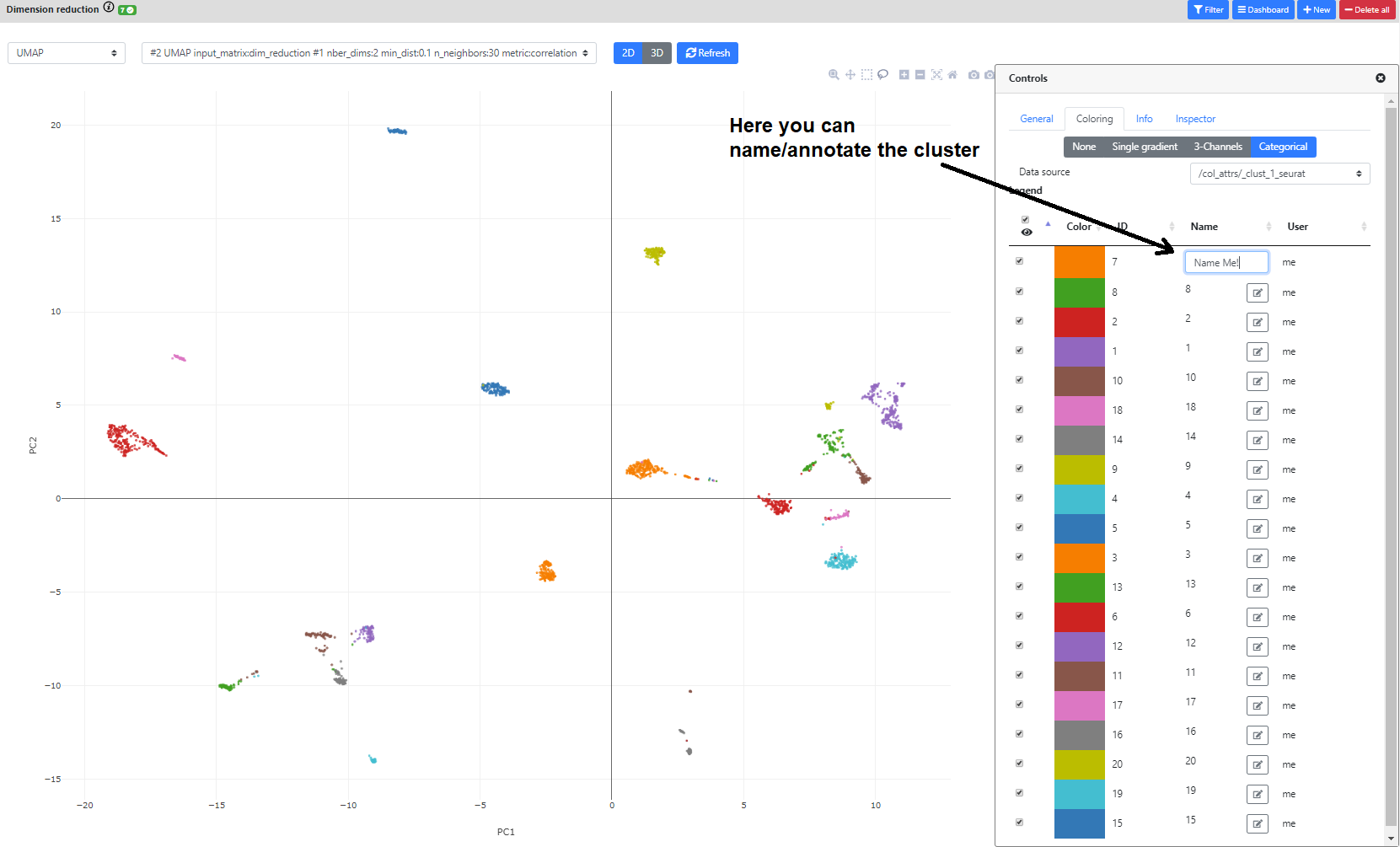
You can also click the bottom right blue button "Controls" to modify the point size/color/transparency. In this view, you can also color the plot according to metadata or clustering results.
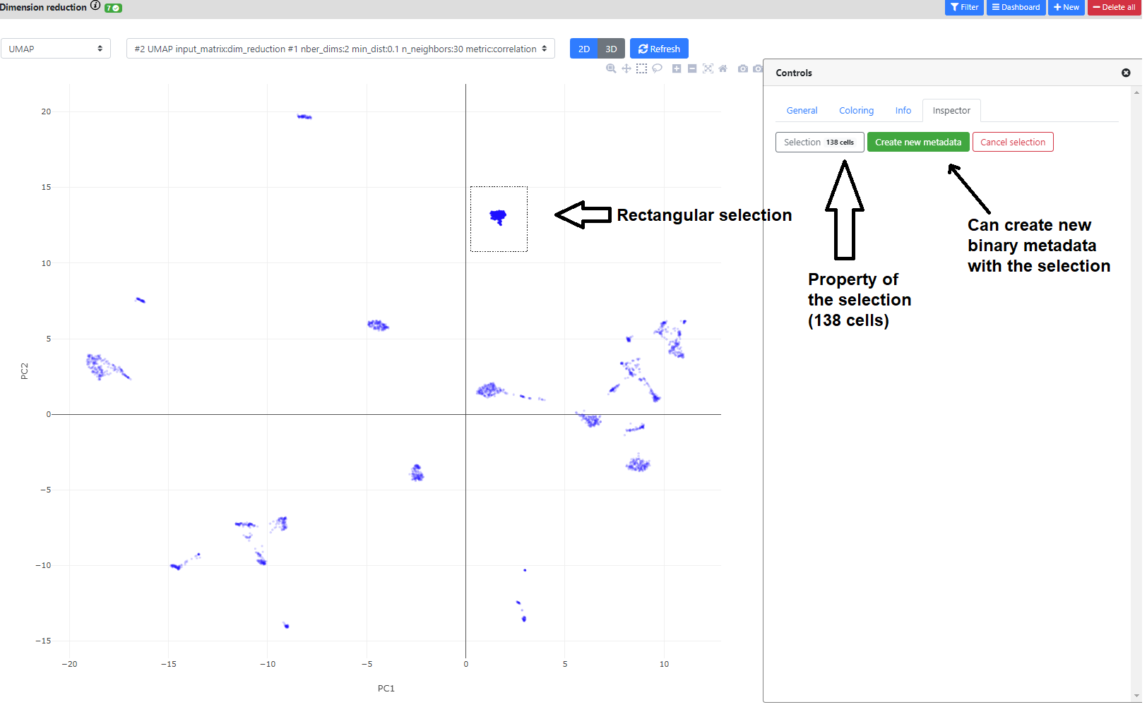
The plot is fully interactive, so you can zoom in, move, or hover on the cells to see their names/clusters.
You can also click on the greyed icons on the top left to recenter the plot, or perform a rectangular/lasso selection.
If you perform a selection, you can name it, and add it in the .loom file as a novel metadata. It will be a [0,1] binary annotation of the cells (1 = selected), that can further be used for coloring, or in the differential expression step.
Finally, if you color the plots using a categorical metadata (such as a clustering result), you have the possibility to name the clusters according to some annotation you deem useful (such as cell type annotation).
Next, we will perform cell clustering...
Of note
The cell type manual annotation of the clusters is not used elsewhere for now, but we are developing ways of making cell annotation more easy and to store these annotation in a central database for all ASAP users.
Step 7: Cell clustering
In this step, we aim at clustering the cells into groups that have similar transcriptomes, the goal being to recapitulate cell types or subpopulation that would be present in your dataset.
But this step is often very arbitrary, and may require lots of tuning for obtaining a satisfactory output (which is frustrating). That is why we also allow to create manual selection directly on the dim. reduction plots, so you can always find marker genes for the population/clusters you find the most interesting.
Indeed, after this step, the goal is to find all the marker genes of the found clusters, tofurther annotate the cells into relevant cell types/states
Again, many methods are available for performing this step, but recent benchmarking have shown that graph-based clustering methods were more efficients (such as the one implemented in the Seurat package). So we recommend these methods. Here I will thus run Seurat method (which is also one of the fastest method to run.
When the computation is over, you will see the result card and you can click on it to see the list of the clusters and the associated cells.
You can also go back to the dimension reduction plot, and color it by the result of your clustering.
Now it's time to find marker genes for your clusters. For this, we will go to the Differential Expression step.
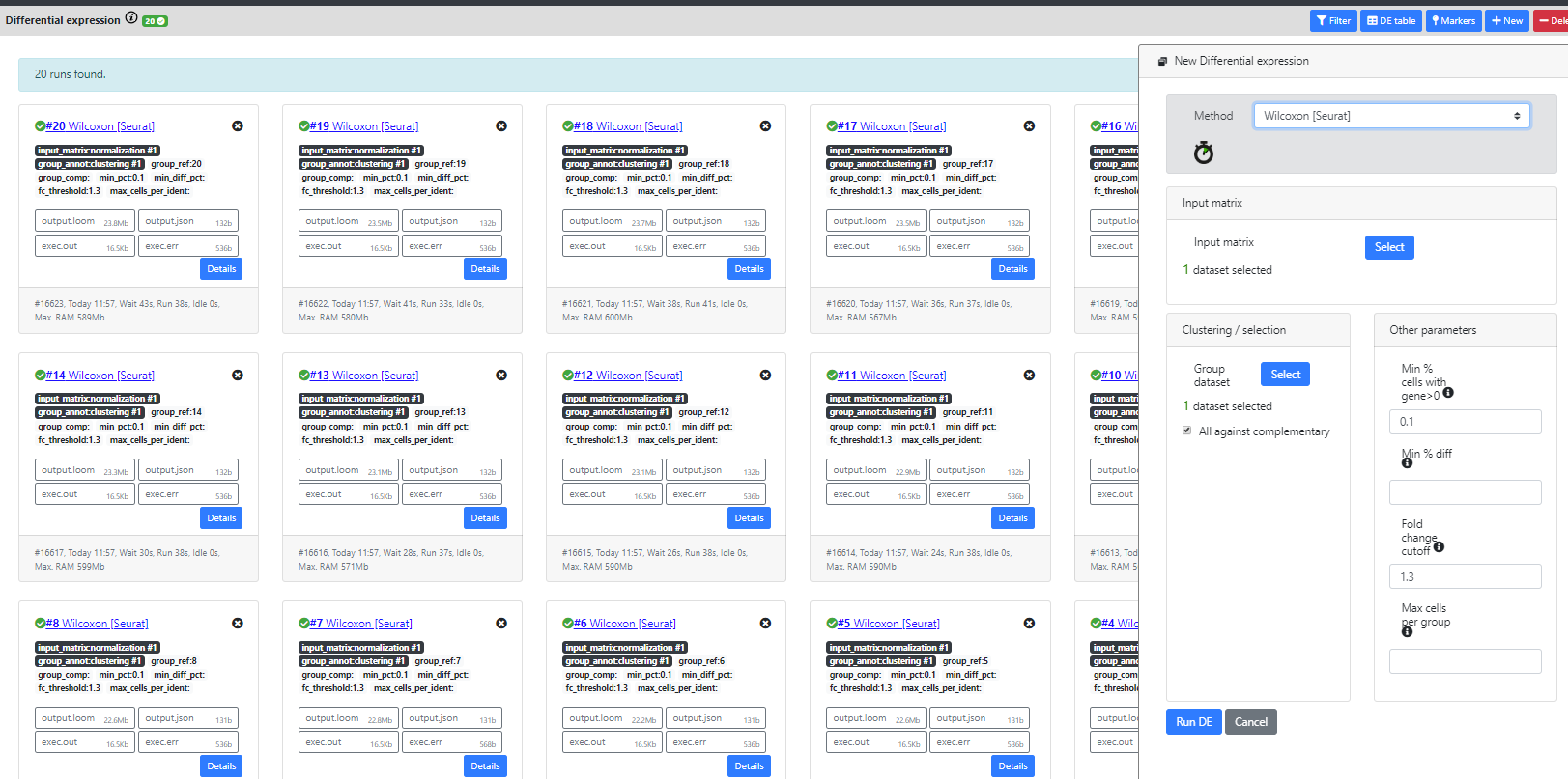
Step 8: Differential Expression
In this step, the main goal is to find marker genes for your clusters.
In certain applications though, it can also be used to compare two populations, or groups of samples (in the case of bulk dataset).
In ASAP, this step can be used to compare any two groups of cells. We also implemented a "All Marker Genes" method that automatically computes the marker genes for every cluster of a clustering result.
As you will see, many differential expression methods were implemented in R (Seurat, limma, DESeq2) or re-implemented by us in Java for the purpose of scalability (Wilcoxon-ASAP). Only Seurat and our homemade Wilcoxon methods are scalable to big datasets.
Recent benchmarking papers have shown that standard t-test/wilcoxon tests were performing as well (or better) than single-cell specific method, with the advantage of being fast to compute.
Seurat recommends using the wilcoxon test, so this is the one we will use in this tutorial.
Of note
We realize that when the dataset has a lot of clusters, this view can be filled with DE results, which is not very user-friendly. The "DE table" and "Markers" view is currently a good alternative for visualizing the results in a better way, but we are investigating other possible views.
When the DE is computed, you can switch view using the blue button on the top bar. From the "Dashboard" to the "DE table" view.
The "DE table" view shows the number of up- and down-regulated genes for every cluster (the up-regulated genes being the main marker genes). You can click on the green/red numbers to see the list of DE genes for every run.
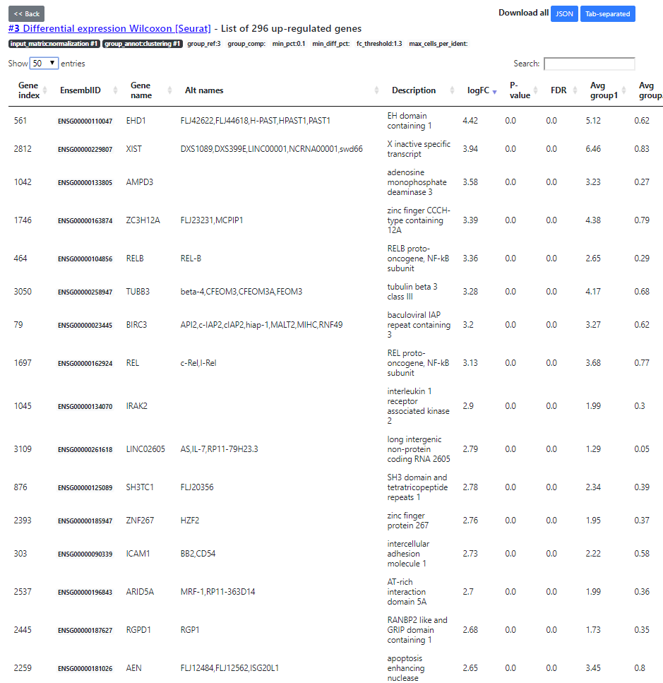
Here you see the list of DE genes, filtered according to a default FDR5% threshold (that you can change in the DE table view). Then, after applying the FDR filtering, we sort the DE genes by decreasing abs(Fold Change) order. The top ones being the most interesting DE genes.
In addition, we also implemented a "Markers" view that lists the top 10 up- down- regulated genes for every cluster. This helps to have a quick view of the most interesting marker for every cell cluster/cell type.
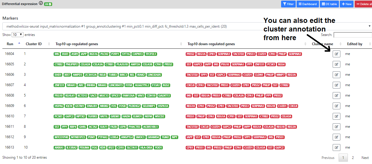
But sometimes, it may be difficult to know the purpose/pathway of the marker genes.
This is why we use the last step: the functional enrichment.
Step 9: Functional Enrichment
This final step's purpose is to understand the role of DE genes (or marker genes).
For doing this, we will check if the list of marker genes found for a particular clustering result is over-represented in some known gene sets or biological pathways (ths is called enrichment).
For doing this, we will run a statistical method called Fisher's Exact Test.
In ASAP, we developed the functional enrichment step in Java using a simple Fisher's Exact Test
Often, this test is over-inflating the p-values because it selects a wrong background (all genes of the species of interest for example).
But in ASAP, since we know the original dataset, we can consider the correct set of genes as background, thus not inflating the resulting p-values.
Moreover, we specifically developed this method for .loom files, which makes it scalable to any dataset.
Now, I'll run a FET on the results from the Differential Expression step. In particular, there is one cluster with marker genes that I cannot interpret. So I'll run the enrichment on the marker genes of this cluster.
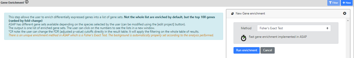
Again, the results of the FET are listed in a "Dashboard" view, or in an "Enrichment table" view.